As the 2012 season winds down and the offseason picks up, it's time for an annual question: "What will the drivers' new paint schemes look like?"
Posted on this page are new Sprint Cup Series 2013 paint schemes. The schemes here are in order of car number; so Brad Keselowski is near the top, versus Carl Edwards is down towards the bottom of the page. Check out these new paint jobs, and tell people what you think of them in the comments below.
Keep coming back, as I will update this page and update it with newly released schemes as often as possible leading up to the start of the new season. If you happen to see any new cars that haven't been added yet, or have a better picture of it, then feel free to message me or post in in the comments.
Generic 2013 Body Styles:
#1 - Jamie McMurray: McDonald's Chevrolet
#2 - Brad Keselowski: Miller Lite Ford
#5 - Kasey Kahne: Farmers Insurance Chevrolet
#5 - Kasey Kahne: Time Warner Cable Chevrolet
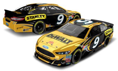
#9 - Marcos Ambrose: DeWalt Ford
#9 - Marcos Ambrose: Stanley Ford
#10 - Danica Patrick: GoDaddy Chevrolet
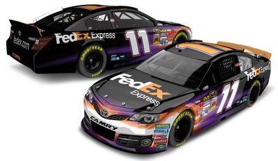
#11 - Denny Hamlin: FedEx Express Toyota
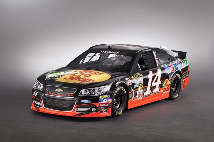
#14 - Tony Stewart: Bass Pro Shops Chevrolet
#14 - Tony Stewart: Mobil 1 Chevrolet
#15 -Clint Bowyer: Peak Toyota
#16 - Greg Biffle: 3M Ford
#17 - Ricky Stenhouse Jr.: Best Buy Ford
#17 - Ricky Stenhouse Jr: Zest Ford
#20 - Matt Kenseth: Dollar General Toyota
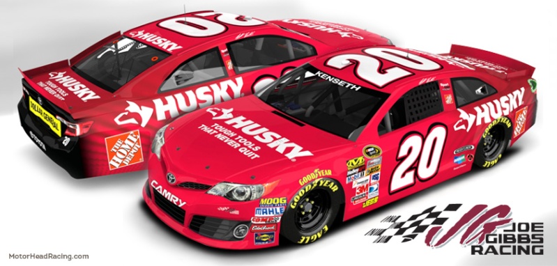
#20 - Matt Kenseth: Husky Tools Toyota
#21 - Trevor Bayne: Motorcraft Ford
#20 - Joey Logano: Pennzoil Ford
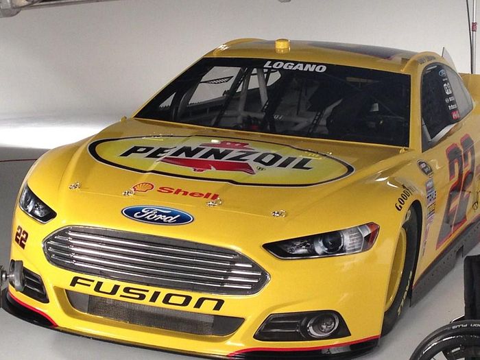
#22 - Joey Logano: Pennzoil Shell Ford
#24 - Jeff Gordon: Drive To End Hunger Chevrolet
#24 - Jeff Gordon: Pepsi Max Chevrolet
#27 - Paul Menard: Menards Chevrolet
#29 - Kevin Harvick: Budweiser Chevrolet
#31 - Jeff Burton: Caterpillar Chevrolet
#39 - Ryan Newman: Quicken Loans Chevrolet
#42 - Juan Pablo Montoya: Target Chevrolet
#47 - Bobby Labonte: House-Autry Toyota
#48 - Jimmie Johnson: Lowe's Chevrolet
#48 - Jimmie Johnson: Jimmie Johnson Foundation Chevrolet
#48 - Jimmie Johnson: Lowe's Yellow Special (to be run in the Budweiser Shootout)
#56 - Martin Truex Jr.: NAPA Toyota
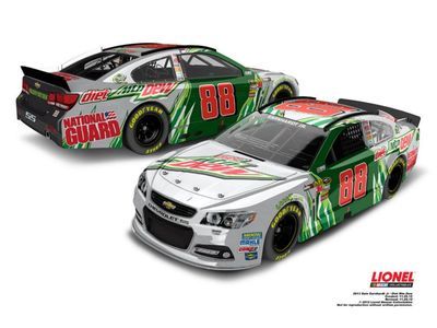
#88 - Dale Earnhardt Jr: Diet Mountain Dew Chevrolet
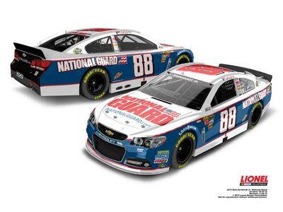
#88 - Dale Earnhardt Jr.: National Guard Chevrolet
#92 - Brian Keselowski: BK Moving Ford
#99 - Carl Edwards: Fastenal Ford
#99 - Carl Edwards: UPS Ford

updated by @jacob-behrman: 12/05/16 04:00:58PM


